|
|
Post by usernametoolong on Aug 12, 2014 8:19:51 GMT -5
I don't think we've done that one.
The Guardian just did an article following a new edition of Charlie and the Chocolate Factory. So far, the comments have yielded this
Do you have any favourites? |
|
|
|
Post by Desert Dweller on Aug 12, 2014 19:36:27 GMT -5
I don't even understand that "Charlie and Chocolate Factory" cover. I'm having trouble figuring out what the intention was. Really, why?
And, wow, the ones in that Guardian list are amazing. That cover for "1984" is hilariously bad. I kind of want it.
|
|
|
|
Post by Jimmy James on Aug 12, 2014 20:02:42 GMT -5
I have no idea what's going on with that Princess Bride cover either- I certainly don't recall any naked bird-hatted ladies surrounded by skulls from the book, and that feels like something that would stick in your memory. I was never fond of the Hitchhiker's Guide to the Galaxy cover, for whatever paperback edition was available when I picked it up: 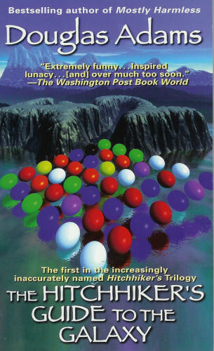 It's not outrageously bad, it's just sort of a head-scratcher. The forty-two in the background makes sense, but I'm not sure what's up with the colored dots. |
|
|
|
Post by ComradePig on Aug 12, 2014 22:00:45 GMT -5
|
|
Deleted
Deleted Member
Posts: 0
|
Post by Deleted on Aug 12, 2014 22:09:59 GMT -5
Is it weird that this only makes me want to read those books? |
|
|
|
Post by ComradePig on Aug 12, 2014 22:15:48 GMT -5
Is it weird that this only makes me want to read those books? Not in the slightest sir, not in the slightest. |
|
|
|
Post by ganews on Aug 13, 2014 9:47:20 GMT -5
That cover for "1984" is hilariously bad. I kind of want it. It's not good, but I think I get what the illustrator was going for, trying to reference as much from the text as possible. Hence the goofy Big Brother poster. The picture of Julia kind of makes sense: her appearance clashing with her Junior Anti-sex League sash. Of course, it's hard to paint the idea that her mere presence and youth are alluring beneath the coveralls or whatever she would really have been wearing. At least you can can tell the illustrator read the book while not on drugs, unlike The Princess Bride. |
|
|
|
Post by Ron Howard Voice on Aug 13, 2014 10:08:45 GMT -5
So far, the comments have yielded this
Unrelated: In elementary school, my class went on a field trip to see a play about Anne Frank. It turned out to be a musical about Anne Frank. A syrupy, happy musical where Anne's recurring number was "It feels so good to be alive!" and her family was caught because the Nazis heard them singing. After we got back, the teachers sent home letters with every student apologizing. EDIT: It might have been called Yours, Anne. |
|
|
|
Post by usernametoolong on Aug 13, 2014 11:10:43 GMT -5
Ron Howard Voice Part of me now badly wants to see this, there was apparently a production in Manchester a couple of months ago, maybe in London soon?
|
|
|
|
Post by Jean Luc de Lemur on Aug 14, 2014 6:31:41 GMT -5
I have no idea what's going on with that Princess Bride cover either- I certainly don't recall any naked bird-hatted ladies surrounded by skulls from the book, and that feels like something that would stick in your memory. I was never fond of the Hitchhiker's Guide to the Galaxy cover, for whatever paperback edition was available when I picked it up: It's not outrageously bad, it's just sort of a head-scratcher. The forty-two in the background makes sense, but I'm not sure what's up with the colored dots. It looks to me like an early demonstration of a fractal-based scenery generator in the background with some test for generating reflections in water in the foreground . It might have been pretty cutting-edge looking in the eighties or so and it seems like the sort of stuff Adams was into, but it really doesn’t work all that well as a cover. What it really looks like to me, though, is a textbook cover. |
|
|
|
Post by MrsLangdonAlger on Aug 14, 2014 6:40:33 GMT -5
I can't stand the Twilight cover ripoff trend and it feels like it never ends. I read a lot of YA too so I see that cover style a lot when I'm trying to find new stuff to read.
|
|
|
|
Post by Jimmy James on Aug 14, 2014 8:16:27 GMT -5
It looks to me like an early demonstration of a fractal-based scenery generator in the background with some test for generating reflections in water in the foreground . It might have been pretty cutting-edge looking in the eighties or so and it seems like the sort of stuff Adams was into, but it really doesn’t work all that well as a cover. What it really looks like to me, though, is a textbook cover. That's exactly it! Take off the review quote and slap a title like Parallel Processing for Scientific Computing on there, and make undergrads pay $150 for a new edition every two years. * I don't know what other folks may have studied, but I found this strange gap between the books I bought for physics courses and the books friends would buy for computer science courses. We'd get a book cover like this, which is a little unimaginative, but it makes sense. You put Maxwell's equations on your Electrodynamics book. Sure. The CS books would instead get dinosaurs on their operating systems book,  because who the hell knows why? |
|
|
|
Post by sarapen on Aug 15, 2014 15:33:26 GMT -5
Is it weird that this only makes me want to read those books? Amish Vampires in Space! Who wouldn't want to read that book? Also, I've been looking forever for that Soldiers book with the astronaut fighting the centaur, it's pretty much impossible to Google the title. |
|
|
|
Post by ComradePig on Feb 27, 2016 16:30:42 GMT -5
Ameriicaaaaaaaaaaaaaaaaaaaaaaaaaaaaaaaaaa  To be clear, the plot description is as terrible as the cover: "When Captain John Rumford, USMC, stands up for the dead Marines of Iwo Jima against the forces of political correctness that have invaded his beloved Corps, he is promptly cashiered for his trouble. But upon his return to his native Maine, he discovers that even in the countryside, there is no escaping the political correctness that has spread throughout the United States of America." |
|
|
|
Post by Douay-Rheims-Challoner on Feb 27, 2016 16:51:37 GMT -5
ComradePig For some reason that made me think of Harold Covington, the white supremacist who advocates for a Pacific Northwest white nation state, who is also a novelist, so I checked his covers out. His central book series is about that hypothetical state:    ...and so on, and on, and on. Clearly the guy likes his tricolour design. ...and so on, and on, and on. Clearly the guy likes his tricolour design.Besides that he's got this:  Of course he does. Of course he does.And this one, about supernatural policing of vampires in Dublin (small world), is something else: 
|
|
|
|
Post by ComradePig on Feb 27, 2016 17:33:48 GMT -5
ComradePig For some reason that made me think of Harold Covington, the white supremacist who advocates for a Pacific Northwest white nation state, who is also a novelist, so I checked his covers out. And this one, about supernatural policing of vampires in Dublin (small world), is something else: Yes sir, that is a whole lot of...something. |
|
|
|
Post by Baramos on Mar 13, 2016 2:22:04 GMT -5
I thought the Wheel of Time covers were pretty bad until I saw these.
|
|
|
|
Post by 🔪 silly buns on Mar 13, 2016 7:52:12 GMT -5
I haven't bothered to read this book, but saw it on the cart of free books at work and grabbed it based on the cover, because wtf.....  |
|
|
|
Post by Douay-Rheims-Challoner on Mar 22, 2016 15:28:56 GMT -5
 If it sounds like it rhymes with concern over ethical journalism, well, that's on purpose. |
|
|
|
Post by Douay-Rheims-Challoner on Nov 5, 2016 7:31:41 GMT -5
|
|