|
|
Post by ganews on Sept 6, 2014 18:05:06 GMT -5
Because obscene Oregon yellow is on TV right now. Although I do like the wings on the shoulders.
Great and terrible uniforms?
|
|
|
|
Post by Nudeviking on Sept 6, 2014 21:05:18 GMT -5
Though they are totally disgusting, I have a soft spot in my heart for the yellow and brown Padres uniforms of the 70s and 80s. 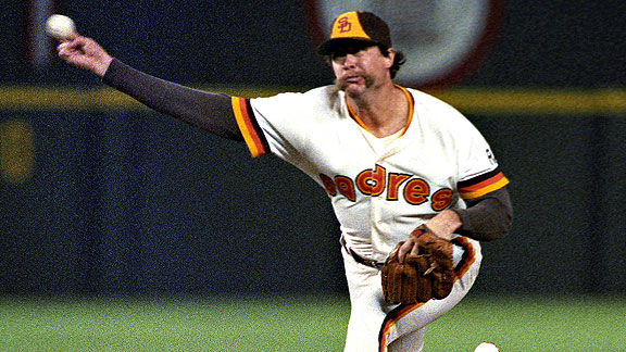 |
|
|
|
Post by ganews on Sept 6, 2014 21:31:46 GMT -5
I always appreciated the Pirates hats on my older baseball cards.  |
|
|
|
Post by Great Unwashed on Sept 7, 2014 0:20:47 GMT -5
My super rugby's teams alternate is a lime green affair that is just gross   |
|
|
|
Post by Great Unwashed on Sept 7, 2014 2:06:39 GMT -5
|
|
|
|
Post by Jean-Luc Lemur on Sept 7, 2014 7:48:17 GMT -5
This thread isn’t complete without 24th-Century Racquetball:  |
|
Baron von Costume
TI Forumite
 Like an iron maiden made of pillows... the punishment is decadence!
Posts: 4,683 
|
Post by Baron von Costume on Sept 7, 2014 12:10:39 GMT -5
Always one of my favourite old terrible unis basically any version of the Golden Seals outfit.  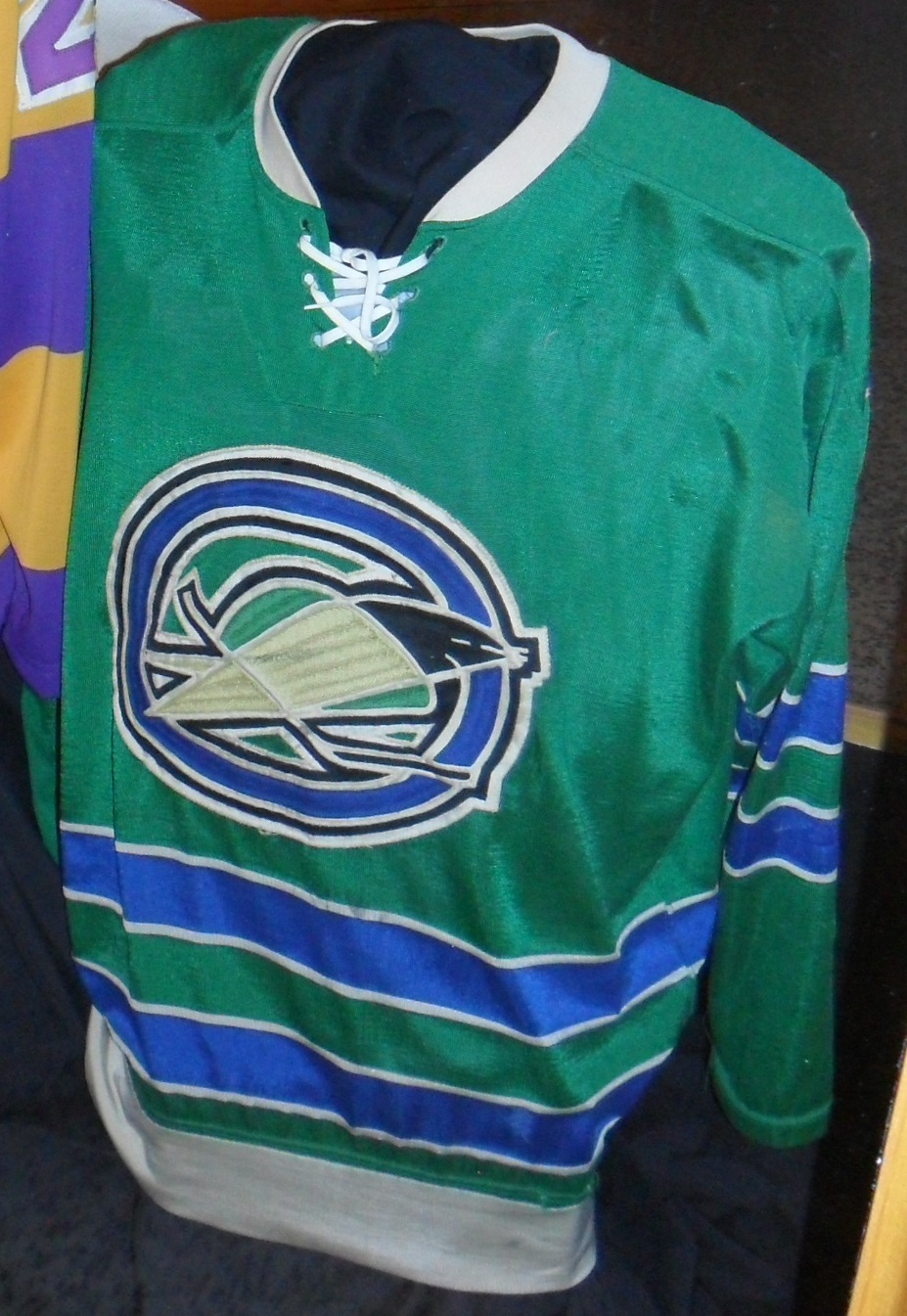 |
|
|
|
Post by ganews on Sept 7, 2014 17:23:05 GMT -5
Always one of my favourite old terrible unis basically any version of the Golden Seals outfit. Nice username/thread synergy. |
|
|
|
Post by Albert Fish Taco on Sept 7, 2014 19:43:25 GMT -5
Though they are totally disgusting, I have a soft spot in my heart for the yellow and brown Padres uniforms of the 70s and 80s.  I'll see your early 80's Padres and raise you their NL West contemporaries the Astros -  |
|
|
|
monodrone
Prolific Poster   Come To Brazil
Posts: 2,565 
|
Post by monodrone on Sept 8, 2014 6:06:54 GMT -5
Terrible is more fun so here are some terrible soccer shirts: Who likes yellow and yellow stripes? Newcastle United do! 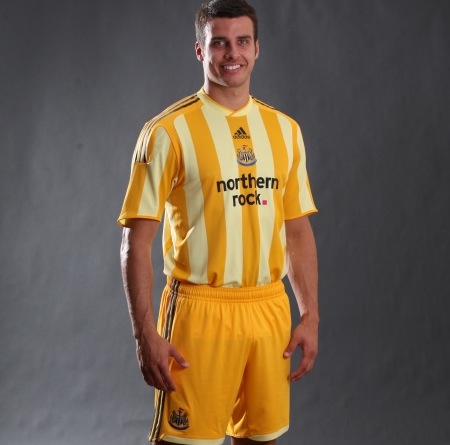 1997: the year Stoke City discovered Word Art.  Hull City, nicknamed the Tigers for some reason.  |
|
|
|
Post by Albert Fish Taco on Sept 8, 2014 7:09:14 GMT -5
I always appreciated the Pirates hats on my older baseball cards.  Of course this thread is incomplete with no mention of the Steelers' throwback uniforms.  Perfect for when you can't decide if you want to reenact that Blind Melon video or that Ducktales ep where the Beagle Boys try to rob the First National Bank of Duckburg. |
|
|
|
Post by Great Unwashed on Sept 8, 2014 7:38:44 GMT -5
Terrible is more fun so here are some terrible soccer shirts: Who likes yellow and yellow stripes? Newcastle United do!  So were they sponsored by mustardayonnaise or mayostard? 1997: the year Stoke City discovered Word Art.  And so it turns out there is something more ungainly than Pulisball. |
|
Invisible Goat
Shoutbox Elitist   Grab your mother's keys, we're leaving
Posts: 2,644 
|
Post by Invisible Goat on Sept 8, 2014 7:59:12 GMT -5
Aww yeah. Both the best and worst uniform of all time. 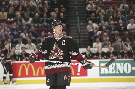 Still own one of these guys but the sleeves are about 8 inches too short now. They don't make 'em like this anymore. |
|
Deleted
Deleted Member
Posts: 0
|
Post by Deleted on Sept 21, 2014 13:11:15 GMT -5
In general I really like older baseball uniforms because of the stripes, the lettering and how things are layered. I am, however, fond of Milwaukee Brewers jerseys that say "Bierbrauer" on the front.  And usually when I see University of Michigan's hockey team--which is only when they play MSU's hockey team--they either wear a white or blue sweater with "MICHIGAN" on the front or a yellow hockey sweater with the blue M on the front, but this sweater I think has a wolverine on it, but it somehow looks more like a beaver to me.  |
|
Deleted
Deleted Member
Posts: 0
|
Post by Deleted on Aug 24, 2015 23:41:23 GMT -5
|
|
|
|
Post by Roy Batty's Pet Dove on Aug 25, 2015 0:46:19 GMT -5
Always one of my favourite old terrible unis basically any version of the Golden Seals outfit.   did the owner have like a five year old kid whom they let scribble down their vague idea of what a seal looks like for that logo? |
|
|
|
Post by ganews on Aug 27, 2015 13:54:46 GMT -5
|
|
Baron von Costume
TI Forumite
 Like an iron maiden made of pillows... the punishment is decadence!
Posts: 4,683 
|
Post by Baron von Costume on Sept 4, 2015 11:08:41 GMT -5
The supposed new third islanders jersey...
/photo/1
|
|
|
|
Post by Superb Owl 🦉 on Sept 4, 2015 15:55:31 GMT -5
The supposed new third islanders jersey... /photo/1 They're moving into the Barclay's Center with the Nets, aren't they? The black and white alternate would kind of make sense. |
|
Baron von Costume
TI Forumite
 Like an iron maiden made of pillows... the punishment is decadence!
Posts: 4,683 
|
Post by Baron von Costume on Sept 4, 2015 15:58:15 GMT -5
Oh yeah, that's totally the "why" but it's still fucking awful.
|
|
|
|
Post by Superb Owl 🦉 on Sept 4, 2015 16:22:46 GMT -5
Oh yeah, that's totally the "why" but it's still fucking awful. Yea, I don't get people who think those Brooklyn Nets jerseys are so great. Is it just a matter of enduring over-busy 90's/00's jerseys for so many years, that now anything that sticks to two colors and is relatively clean is a relief? |
|
|
|
Post by Return of the Thin Olive Duke on Nov 6, 2015 14:46:39 GMT -5
Though they are totally disgusting, I have a soft spot in my heart for the yellow and brown Padres uniforms of the 70s and 80s. I wish the Padres went back to brown and yellow. It suits San Diego more as a city, and there's just way too much red and blue in MLB right now. 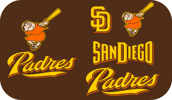 |
|
|
|
Post by MarkInTexas on Nov 13, 2015 16:15:03 GMT -5
So, colorblind issues aside, what did everyone think of the NFL's solid color uniform experiment?
|
|
Deleted
Deleted Member
Posts: 0
|
Post by Deleted on Nov 14, 2015 5:57:46 GMT -5
So, colorblind issues aside, what did everyone think of the NFL's solid color uniform experiment? should have had some Christmas theme to it. Also, didn't like it because of how the green jets uni blended with the field. The titans jags color rush should go better. |
|
|
|
Post by Albert Fish Taco on Jul 24, 2016 13:44:58 GMT -5
|
|
|
|
Post by Desert Dweller on Jul 24, 2016 18:59:09 GMT -5
Oh, I wish he would come here and destroy all those terribly ugly DBacks uniforms. Sadly, DBacks front office already sold our best prospects for Shelby Miller. Damn, if only they had waited! We could have gotten rid of these terrible uniforms and received an actually good pitcher!
|
|
|
|
Post by Jimmy James on Jul 24, 2016 20:07:33 GMT -5
This is a cover-up- they said he cut up the '76 throwbacks during batting practice, but I choose to believe he was inexpertly trying to rehem all the pants to recreate the infamous shorts paired with those jerseys on a few select occasions. |
|
|
|
Post by Bedroom Pastrami on Jul 29, 2016 10:31:54 GMT -5
The 83 Sox uniforms are a work of art and I will not hear otherwise! My all-time favorite are these: 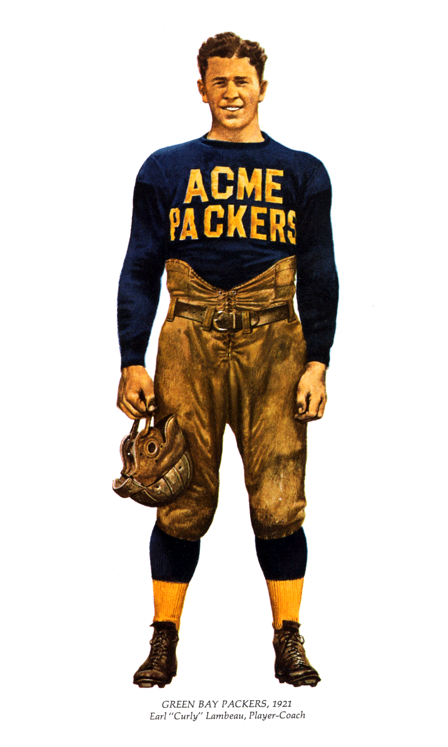 |
|
|
|
Post by Ron Howard Voice on Jul 29, 2016 11:26:28 GMT -5
Oh, I wish he would come here and destroy all those terribly ugly DBacks uniforms. Sadly, DBacks front office already sold our best prospects for Shelby Miller. Damn, if only they had waited! We could have gotten rid of these terrible uniforms and received an actually good pitcher! The Diamondbacks' uniforms are a hideous blotch on America and I refuse to watch their games (sorry). |
|