dLᵒ
Prolific Poster   𝓐𝓻𝓮 𝓦𝓮 𝓒𝓸𝓸𝓵 𝓨𝓮𝓽?
Posts: 4,533 
|
Post by dLᵒ on Sept 4, 2015 17:47:49 GMT -5
I figure since I'm tearing down my comp/files and reorganizing everything I'll share my collection of free fonts that I've found useful or atleast pretty. WELP THAT LOOKS OFFLINE CORE HUMANIST SANS www.fontsbyalex.com/[download link near the bottom] I figure I'll start off with my favorite, which I like for it's slightly futuristic feel.     |
|
dLᵒ
Prolific Poster   𝓐𝓻𝓮 𝓦𝓮 𝓒𝓸𝓸𝓵 𝓨𝓮𝓽?
Posts: 4,533 
|
Post by dLᵒ on Sept 5, 2015 9:04:35 GMT -5
|
|
|
|
Post by Jean-Luc Lemur on Sept 5, 2015 14:22:09 GMT -5
Igino Marini, a civil engineer and amateur type enthusiast, designed a revival of the seventeenth-century English Fell types (in several variations—below’s “French Canon,” which I think is probably the best text face) that’s both dignified and has a nice, somewhat idiosyncratic character. He has downloads and history on his website.  |
|
dLᵒ
Prolific Poster   𝓐𝓻𝓮 𝓦𝓮 𝓒𝓸𝓸𝓵 𝓨𝓮𝓽?
Posts: 4,533 
|
Post by dLᵒ on Sept 5, 2015 16:09:30 GMT -5
Mmmm look at them ligatures.
|
|
Trurl
Shoutbox Elitist  
Posts: 7,693
|
Post by Trurl on Sept 5, 2015 20:39:54 GMT -5
Igino Marini, a civil engineer and amateur type enthusiast, designed a revival of the seventeenth-century English Fell types (in several variations—below’s “French Canon,” which I think is probably the best text face) that’s both dignified and has a nice, somewhat idiosyncratic character. He has downloads and history on his website.  There's something weird about the stroke weights - reminds me of Edward Gorey's lettering. |
|
|
|
Post by Jean-Luc Lemur on Sept 7, 2015 12:33:43 GMT -5
Trurl I think that comes from it being a very straight revival of an old typeface—evidently a lot of them are very quirky when you look at them letter-to-letter but somehow work well in text (or so Fred Smeijers claimed when he was designing the not-free, but lovely and ubiquitous in the Netherlands Quadraat).
|
|
dLᵒ
Prolific Poster   𝓐𝓻𝓮 𝓦𝓮 𝓒𝓸𝓸𝓵 𝓨𝓮𝓽?
Posts: 4,533 
|
Post by dLᵒ on Sept 7, 2015 13:57:10 GMT -5
|
|
Trurl
Shoutbox Elitist  
Posts: 7,693
|
Post by Trurl on Sept 8, 2015 16:03:26 GMT -5
Trurl I think that comes from it being a very straight revival of an old typeface—evidently a lot of them are very quirky when you look at them letter-to-letter but somehow work well in text (or so Fred Smeijers claimed when he was designing the not-free, but lovely and ubiquitous in the Netherlands Quadraat). It's not just that, it's that some of the curves are not symmetric or something. Look at the stroke of the left-hand side of the uppercase "O" - where the widest part of the stroke is, above the horizontal, it doesn't thin as smoothly towards the top as it does towards the bottom. It makes it look like the kind of imperfections you get in hand-lettering. I mean that could just be a rasterization or hinting artefact, but the effect is to make it look slightly dishevelled. That's not to say I don't like the font - I do, very much so. I don't like fonts that look too perfect and clean, I like the imperfections of letterpress. I bet that font would be lovely in blocks. |
|
|
|
Post by Jean-Luc Lemur on Oct 1, 2015 20:34:10 GMT -5
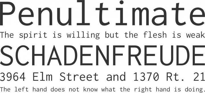
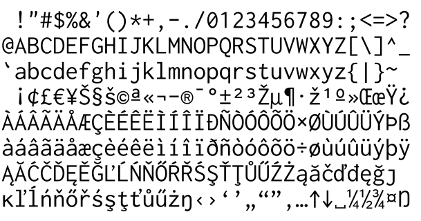
Want a lovelier monospace font for work in the terminal, coding, or just because you’re a bit obsessive-compulsive about letters lining up? Inconsolata is a lovely option:   |
|
|
|
Post by Jean-Luc Lemur on Oct 11, 2015 20:25:36 GMT -5
Although the entire Questa Project isn’t free, the regular styles are (and relatively cheap IIRC). When I got it they hadn’t released any more than the regular style of Questa Grande, which is a nice, sophisticated option for titles/stuff in large print (I mostly work in XeLaTeX and encode Questa Grande as my font for headings, titles and such, with regular Questa for body text and Questa Sans for map labels, slideshows and the like):  |
|
Hippo
Prolific Poster  
Posts: 6,742 
|
Post by Hippo on Apr 10, 2016 13:56:23 GMT -5
Hey other font dorks, I realise this is late by.. oh, forever, but I would like to turn your attention to my first fo'-pay font family, it's poorly entitled Riffic because I lack naming imagination and I do that now for sweet skrilla instead of just allowing everyone to use it for free. It's a "good" font... at least to me, it's mine and while they're not typefaces suited to swathes of body text, they're nice for display purposes. Just in case you're all "well, we like free even if it's not good" then a cutdown version of the bold weight is available on Font Squirrel, pic below should lead you to it and who knows, maybe one day there'll somehow be a use for it in your world.
|
|
Deleted
Deleted Member
Posts: 0
|
Post by Deleted on Apr 14, 2016 1:07:09 GMT -5
Hey other font dorks, I realise this is late by.. oh, forever, but I would like to turn your attention to my first fo'-pay font family, it's poorly entitled Riffic because I lack naming imagination and I do that now for sweet skrilla instead of just allowing everyone to use it for free. It's a "good" font... at least to me, it's mine and while they're not typefaces suited to swathes of body text, they're nice for display purposes. Just in case you're all "well, we like free even if it's not good" then a cutdown version of the bold weight is available on Font Squirrel, pic below should lead you to it and who knows, maybe one day there'll somehow be a use for it in your world.
right-- utility! how would the average user interact with these? are they chiefly for word processing applications and page designers? |
|
Hippo
Prolific Poster  
Posts: 6,742 
|
Post by Hippo on Apr 14, 2016 1:21:29 GMT -5
Hey other font dorks, I realise this is late by.. oh, forever, but I would like to turn your attention to my first fo'-pay font family, it's poorly entitled Riffic because I lack naming imagination and I do that now for sweet skrilla instead of just allowing everyone to use it for free. It's a "good" font... at least to me, it's mine and while they're not typefaces suited to swathes of body text, they're nice for display purposes. Just in case you're all "well, we like free even if it's not good" then a cutdown version of the bold weight is available on Font Squirrel, pic below should lead you to it and who knows, maybe one day there'll somehow be a use for it in your world.
right-- utility! how would the average user interact with these? are they chiefly for word processing applications and page designers? I guess they'd use it like any other font suggested in this thread. Mostly for graphic designers and other design apps (including word processing apps) but also for anyone who wanted to make fliers, labels for their cans, basically any use that people would generally have for a font, just don't format your resume in it. There's not much special about it, it works like any other font would. |
|
Deleted
Deleted Member
Posts: 0
|
Post by Deleted on Apr 14, 2016 11:54:33 GMT -5
right-- utility! how would the average user interact with these? are they chiefly for word processing applications and page designers? I guess they'd use it like any other font suggested in this thread. Mostly for graphic designers and other design apps (including word processing apps) but also for anyone who wanted to make fliers, labels for their cans, basically any use that people would generally have for a font, just don't format your resume in it. There's not much special about it, it works like any other font would. thanks!✌ i am grateful for all these freebies, but i was thinking about how say for example here or on tumblr, the only way to take advantage would be through a finished project-- just checking.  |
|
Hippo
Prolific Poster  
Posts: 6,742 
|
Post by Hippo on Apr 14, 2016 12:28:17 GMT -5
I guess they'd use it like any other font suggested in this thread. Mostly for graphic designers and other design apps (including word processing apps) but also for anyone who wanted to make fliers, labels for their cans, basically any use that people would generally have for a font, just don't format your resume in it. There's not much special about it, it works like any other font would. thanks!✌ i am grateful for all these freebies, but i was thinking about how say for example here or on tumblr, the only way to take advantage would be through a finished project-- just checking.  I'm not sure what you mean by "finished project". |
|
Deleted
Deleted Member
Posts: 0
|
Post by Deleted on Apr 14, 2016 18:08:10 GMT -5
thanks!✌ i am grateful for all these freebies, but i was thinking about how say for example here or on tumblr, the only way to take advantage would be through a finished project-- just checking.  I'm not sure what you mean by "finished project". a thing done offline, then posted, as opposed to live chatting or the like |
|
Hippo
Prolific Poster  
Posts: 6,742 
|
Post by Hippo on Apr 14, 2016 22:00:16 GMT -5
I'm not sure what you mean by "finished project". a thing done offline, then posted, as opposed to live chatting or the like Oh yeah, it's best for headlines and stuff you want to draw attention to, could use it on Tumblr for your entry titles if you wanted but just wouldn't use it for anything people have to read for longer than 10 seconds, it's terrible for that. It works best big and with few words. |
|
|
|
Post by Jean-Luc Lemur on Jul 12, 2018 14:27:38 GMT -5
Probably irrelevant to most people here, but as someone who has to do a lot of math-y writing and produce documents that will be seen by other people without first passing through a publisher I’ve become obsessed with STIX Two, which has its origins in Times/Times New Roman (STIX has its origins as a bunch of extra math/science glyphs that are Times-compatible) but is better suited for reading on a screen, looks better printed out, but is also completely unobstrusive (also really good for e-ink displays, in my experience):
|
|